Friday, June 16, 2017
Wednesday, June 14, 2017
Tattoo
For the tattoo, I drew a snake in an old Victorian Era frame. I used the magic wand tool and the eraser to remove the blank paper from the tattoo background. Then I rotated the image to fit my arm, and warped it so that it looked like it was actually on my arm rather than an image laying on top of another. I used the burn and dodge tools to create shadows and highlights to where they were on my arm to make it look more realistic. If I were to change anything about this project, I would have made the gold part encircle the entire frame, and I would have placed the tattoo on my thigh, because I think it would look better there.
Surrealism
For the surrealism project, I chose to do something that represented two opposites - the land and the sea. I also added a girl who's face is detached because it looks like she's in a sort of dream scape, and she represents the harmony between the sea and land (hence why the sky is calm even though the water is raging and the desert is shadowed in darkness). I used the magnetic lasso tool to crop out the sky from each of the images, which I later replaced with a gradient. The girls hair looked very photoshopped after I removed the background, so I used the paint tool, burn tool, and smudge tool to fix all the ends and the coloring. The original image of the desert had 'moving' rocks, so I used the clone stamp tool to get rid of those so the image didn't look odd. If I were to change anything, I would have dome what I originally planned. I was originally going to have the part of the mountain on the right and the sea on the left come up to meld into swirling clouds encompassing the sun and the moon respectively, but was unable to do so due to time issues.
Tuesday, June 6, 2017
cereal box
As my cereal, I created tumblr o's. I based them off the entirely annoying blue h*ll site: tumblr.com so I used the exact HTML color code that the website uses as the color of my box. I also added some tumblr images like the 'artsy; cereal, rainbow slime, and the skateboarder maze. I also used some textbook tumblr phrases (in comic sans of course) like 'teen angst' and 'do ____ for validation'. I feel like the best technical aspect of this is how I captured the essence of tumblr with how weird it is. If I were to do this project again, I would have changed the topic to something that's more aesthetically pleasing to the eyes rather than something that is fundamentally just blue and memes.
paint project

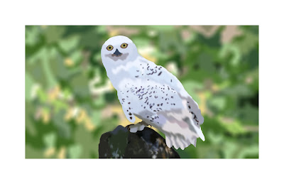
For the paint project I tried to recreate a picture of Hedwig from Harry Potter. I think the strongest technical aspect of this is how I blurred the background and got a feathered look on the owl's body. I found it difficult to make the different hues and shades match the original picture and it seems to not have the same shading. I feel I did well on the speckles to make each individual one match whatever color was beneath it. If I were to do something different, I'd have used the burn tool to create more depth where there should be shadows.
Subscribe to:
Comments (Atom)


